Summary
The Brand Identity: Featuring New Metta Brand
Press
2024-05-06

Read Time 2 Min
Summary
The Brand Identity: Featuring New Metta Brand
Press
2024-05-06
More than just a coffee shop and bakery, metta offers a space for the people of Munich to meet, collaborate and engage in workshops. To help capture the experimental spirit of the brand that offers both a community space and perfectly risen gluten-free baked goods (have you seen those pillowy cinnamon buns?), metta collaborated with Berlin and Munich-based design and technology studio &why to craft a visual system that’s as open to change as the space itself.
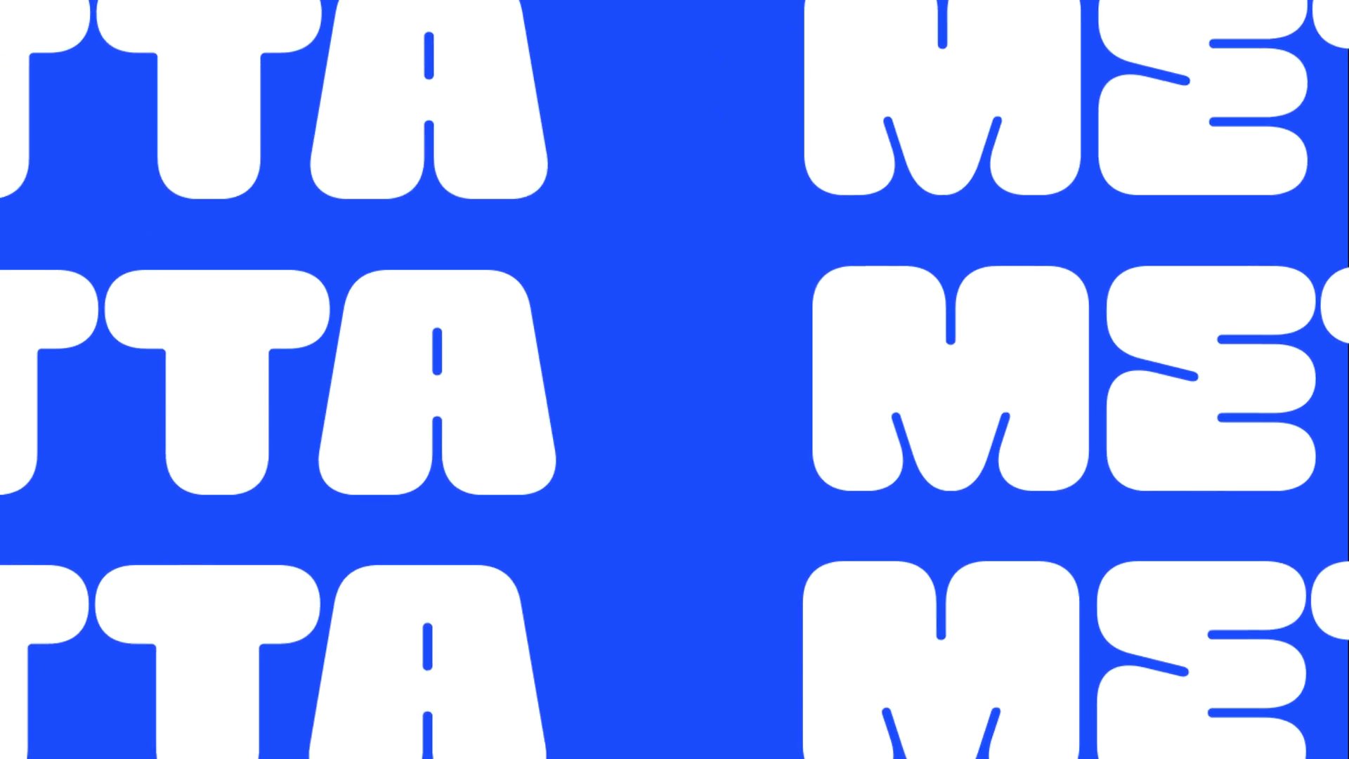
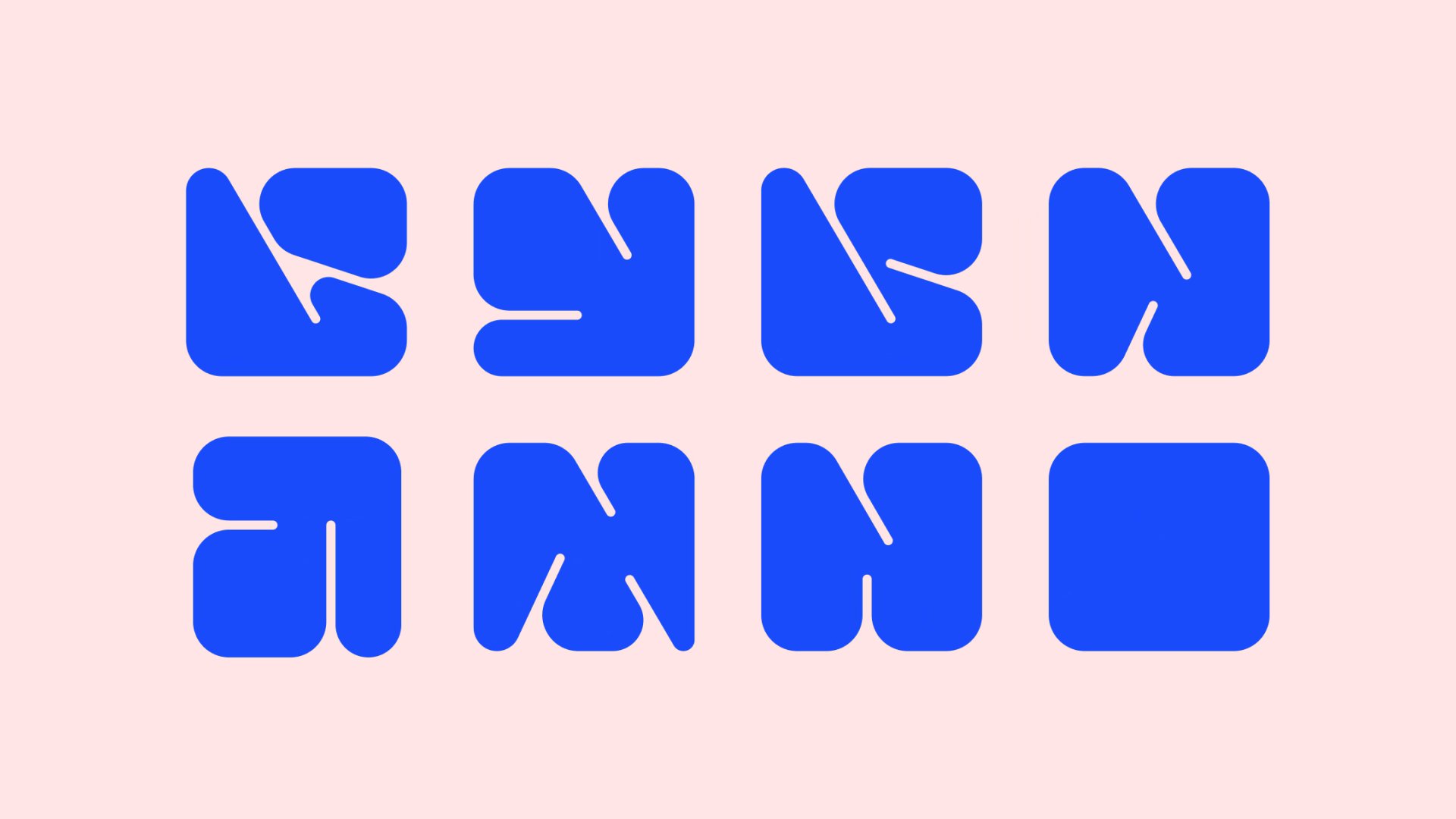
Almost as if taking notes from the fluffy breads and croissants of metta, &why selected GTF Mycena for the wordmark. The typeface, with its plump letterforms, sets the tone for the brand. “Just as metta’s space offers workshops and evolves to meet the diverse needs of its community, GTF Mycena met our vision for a modular shape system. Inspired by the font, we were able to create a user-friendly system that is flexible to use even for non-designers creating brand materials,” Vera Seibel, who oversees art direction and branding at &why, tells us.
Read the full article on The Brand Identity here: https://the-brandidentity.com/project/why-serves-an-identity-for-metta-thats-as-ready-for-change-as-the-bakery-cum-community-spot-itself